Process

Pattycake Pattycake: Playing with Pattern & Texture

Here's a little illustration that started out as a doodle (below), that I then used to experiment with some new brush techniques. I'm loving the interplay of the flat lines & color with the subtle textures, patterns and rough edges. Click on the image to see it in more detail. 

"Pattycake" by Erica Sirotich

Here are the original pencil doodle and ink drawing of "Pattycake" (from my Instagram feed: @ericasirotich).  

"Pattycake" Doodle

"Pattycake" Doodle

"Pattycake" Ink Drawing on the light box.

"Pattycake" Ink Drawing on the light box.

Developing Quilliam and a Peek into my Sketchbooks

I've been pretty quiet over the last month or so because I've been working to develop Quilliam, a favorite character of mine, into a picture book concept! Here are a couple peeks at his new design. 

I've also added a new section to the site focusing on images from my sketchbooks. Here's two pages of Quilliam character exploration and visual development. I'll be adding more to this page as time goes on, so keep an eye out!  

Doggie Wonderland at Leanna Lin's

I'm really excited to participate in my third show at Leanna Lin's Wonderland in Los Angeles, Doggie Wonderland! This one is really special because it's a benefit to raise funds for Ken-Mar Rescue, an LA-based small dog rescue. My own dog, Russell, came to me by way of a similar organization that gives dogs a second chance after time at their first shelter has run out. I couldn't be more grateful for the work of groups like this. What's terrific is that 100% of show proceeds go to the rescue and all work displayed is totally affordable--less than $100 per piece! The show is co-curated by Supahcute, a blog dedicated to cuteness in general and art in particular. Naturally, I had to get in on this event.

"No Finer Friend" by Erica Sirotich

The theme of the artwork in Doggie Wonderland is "Fun Adventures with Your Best Friend" so my piece depicts one such adventure shared by a girl and her dog. I've called it "No Finer Friend." Just one framed print of this piece will be available for purchase at the show.

Show participants include Jerrod MaruyamaBubi Au Yeung and tons of other talented folks I'm honored to share a gallery wall with. Also, Joey Chou created the most adorable event poster ever. Doggie Wonderland opens with a reception at Leanna Lin’s Wonderland on Saturday, May 10, 2014 (6-10pm).

When I first conceived of this piece, I drew it as a boy and his dog. 

But I wanted more visual drama in the piece and a stronger suggestion of wind, so I decided to make the character a girl and focus on her hair blowing in the salty breeze.  

BoyGirlSketch.jpg

In the final sketch with the revised character, I added a few more critters into the mix, as I am known to do :)   

"No Finer Friend" sketch.

"No Finer Friend" sketch.

I used solid blacks in the center of the piece to amplify the girl and her best friend as the focal point.

"No Finer Friend" ink drawing. 

"No Finer Friend" ink drawing. 

I printed it at a diminutive 8" by 8" (giclee), framed it and shipped it off to Leanna Lin's this morning. Such a fun little piece for a great cause.  

And here's an adventure I recently had with my best friend :)

Erica and Russell in Carmel Valley, California.

Erica and Russell in Carmel Valley, California.

Thumbnail, Sketch, Ink, Final: Hard Hat Area

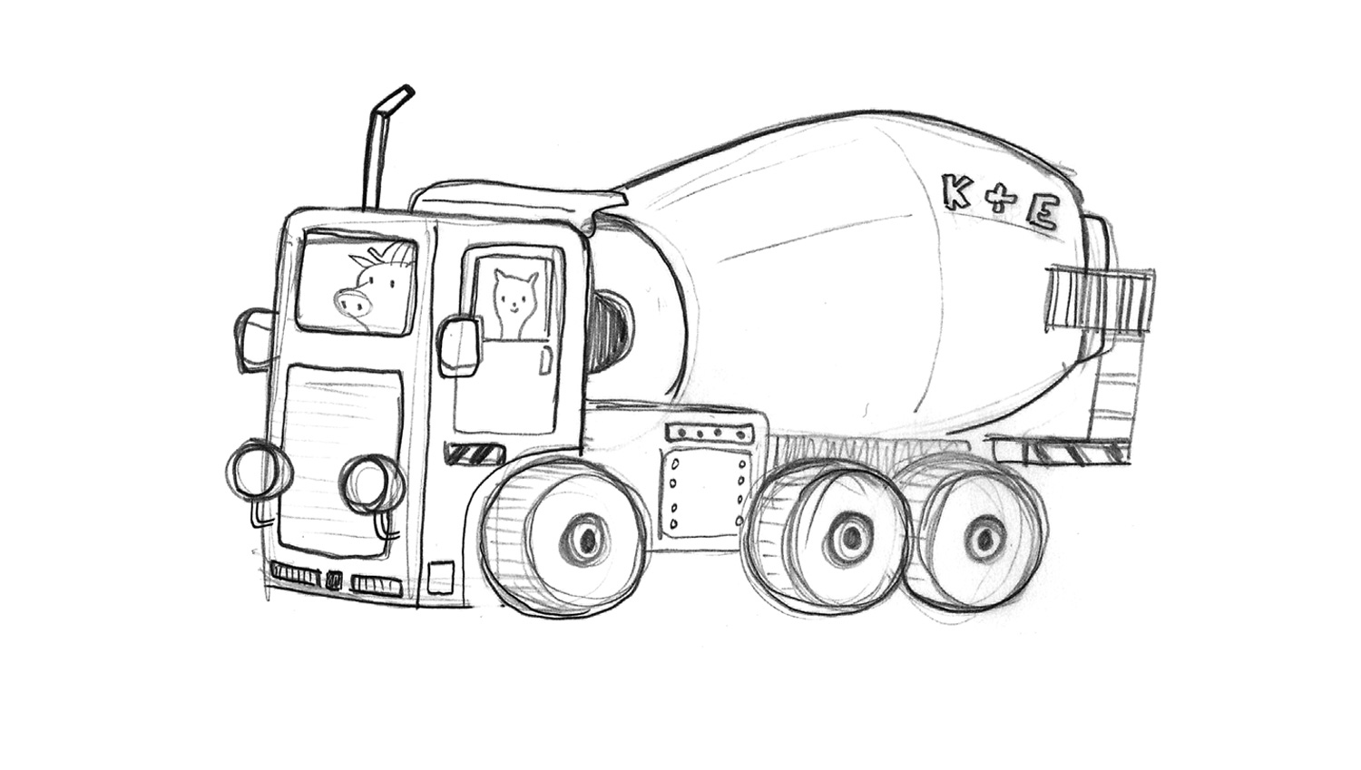
I thought it'd be neat to periodically share a piece's process from its earliest stages to its completion. I recently finished "Hard Hat Area"; my goal for this project was to visually explore a topic that's appealing to children, but that I've had little experience drawing--vehicles & construction equipment. For whatever reason I didn't expect this task to be fun, but I was wrong; I had a blast working with the more boxy shapes and mechanical details this piece required. I also realized that the best way to approach the vehicles would be to treat them as characters too, giving them as much as personality as possible.     

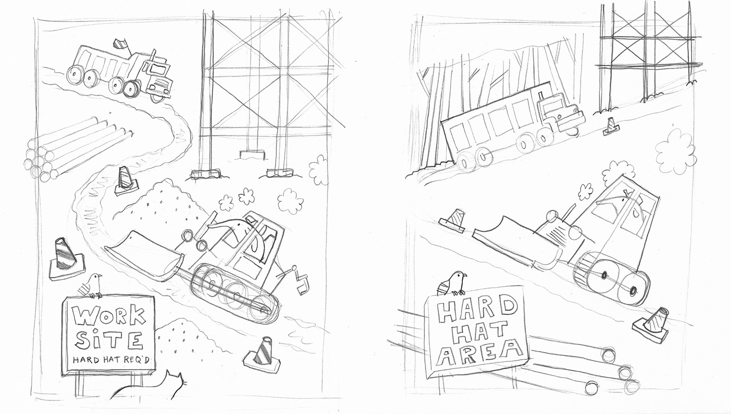
The thumbnails for "Hard Hat Area" were oriented vertically in the beginning. The first one was problematic because it would have rapidly resulted in a head on dump truck-bulldozer collision. The second is much closer to the layout of the final piece. 

First rough sketch of the dump truck. At this stage the driver was some sort of lizard and he looked bored, probably from driving all day.

First rough sketch of the bulldozer. This version is a lot longer than what appears in both the thumbnail and the final piece. I actually really love this dozer design; for the final, I modified it for compositional reasons, making it more compact. But the next time I draw a bulldozer it'll be more like this one, for sure.    

Sketch of a vehicle that wasn't included in the final piece. 

Ink drawing of the dump truck. After refining the sketch of this vehicle I dropped it on a light pad and inked it on a fresh sheet using brush pens & Microns. I prefer this truck's driver much more than the lizard. He's a real no nonsense guy. 

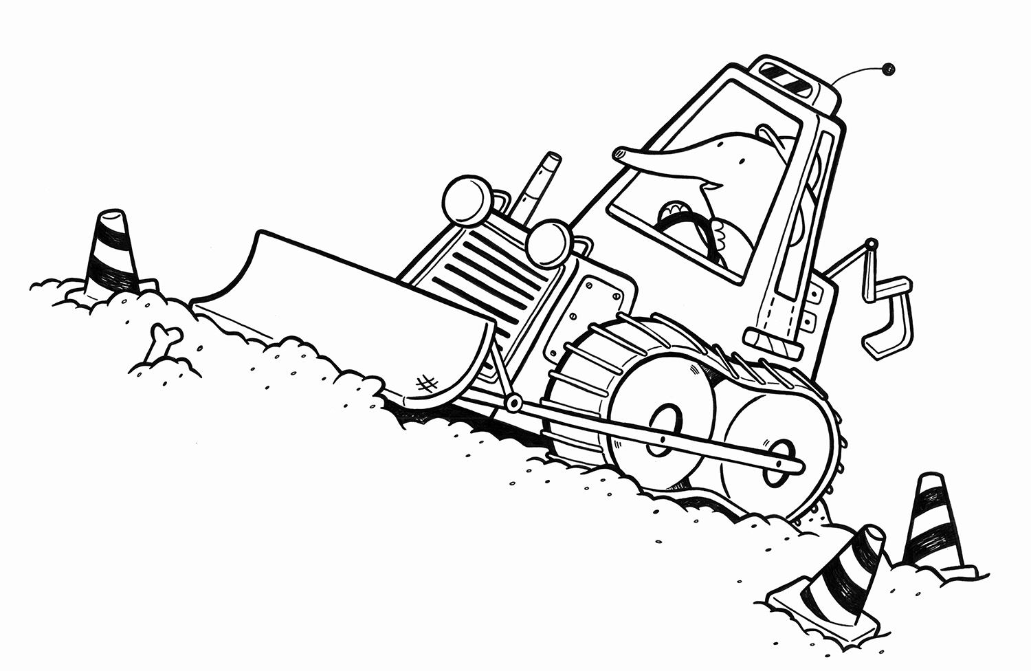
Ink drawing of the bulldozer. This is a much more compact design than in the sketch. It's tighter, a bit more stylized, and fits the space better than the prior design would have. I also think it has a "younger" look than the dozer in the sketch above, which is appropriate, because I envision this to be an image for a very young audience. 

Detail of final piece. 

Detail of final piece. 

Final colored dump truck. I used some new textures and brushes on this, opting for a soft billow of stinky exhaust spewing from both vehicles, rather than the bubbly clouds that appear in the thumbnails. I overlaid a texture to give the entire piece a bit of a grittier, rougher feel. 

Detail of final piece.

Detail of final piece.

I also used a custom Photoshop brush to depict the dust and dirt flying everywhere. But that didn't stop that bear from indulging in an entire slice of Brie cheese right in the middle of the work site.  

Final piece. 

I drew, inked & colored the background elements & secondary characters separately from the vehicles; this helped me play with the piece's composition digitally (it was actually at this later stage in the process that I decided to orient the piece horizontally). I like the versatility of this process; it allows me to make modifications easily when required and really experiment with the piece's overall look and feel. 

California Printed at Rare Device

This month I had the pleasure of participating in a group show, California Printed, hosted and curated by San Francisco boutique and gallery Rare Device. The show features twelve artists' interpretations of California in print form, including work from talented Bay Area artists like Emily Proud and Christina Song. When I was invited, I immediately thought of the print I created a year or two ago, "Living California," a wildlife map of the state. I've been wanting to explore California's prehistoric fauna too, so this ended up being the perfect opportunity to do so!  

"Prehistoric California," a limited edition print created for Rare Device's California Printed group show. 

"Prehistoric California," a limited edition print created for Rare Device's California Printed group show. 

It turns out that more is known of the mammalian megafauna that lived in the state during the Cenozoic (due, in part, to specimens unearthed at the La Brea Tar Pits) than about the dinosaurs of the state's Mesozoic age. So I ended up combining creatures from all three major prehistoric periods of California's history on one map, rather than just depicting the state's dinosaurs, as originally planned. Each creature is linked to its time period with markers preceding their species' names and a corresponding key on the right side of the map.    

Here are a few of the original ink drawings included in the piece--of the Giant Ground Sloth, two species of Ankylosaur, and the Pygmy Mammoth. These are some of my favorite prehistoric creatures anyway, so finding that they inhabited the California of yesteryear was pretty exciting.

photo 3.JPG
photo 2-1.JPG
photo 1-1.JPG
Detail of the completed "Prehistoric California" print by Erica Sirotich.

Detail of the completed "Prehistoric California" print by Erica Sirotich.

"Prehistoric California," the new companion piece to "Living California," is exclusive to Rare Device for the duration of the show (until February 26, 2014). Prints, including the framed edition #1, are available from the San Francisco store and online

At the California Printed opening on January 10, 2014. Framed and unframed prints are available from Rare Device.

At the California Printed opening on January 10, 2014. Framed and unframed prints are available from Rare Device.

For a discussion of how "Living California" was created, you can visit the Ten Paces and Draw illustration blog, where I shared a process post a couple years ago. "Prehistoric California" was, mostly, created in the same way, except that some of the leg work was already done this time around!   

"Living California" by Erica Sirotich

"Living California" by Erica Sirotich