Illustration

Pattycake Pattycake: Playing with Pattern & Texture

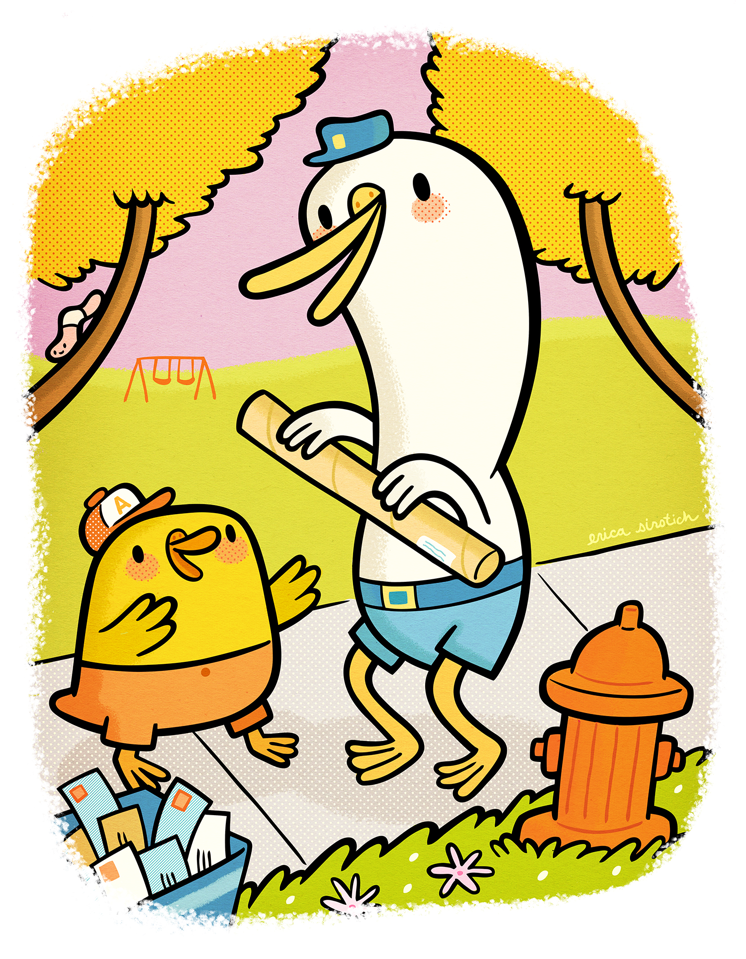
Here's a little illustration that started out as a doodle (below), that I then used to experiment with some new brush techniques. I'm loving the interplay of the flat lines & color with the subtle textures, patterns and rough edges. Click on the image to see it in more detail. 

"Pattycake" by Erica Sirotich

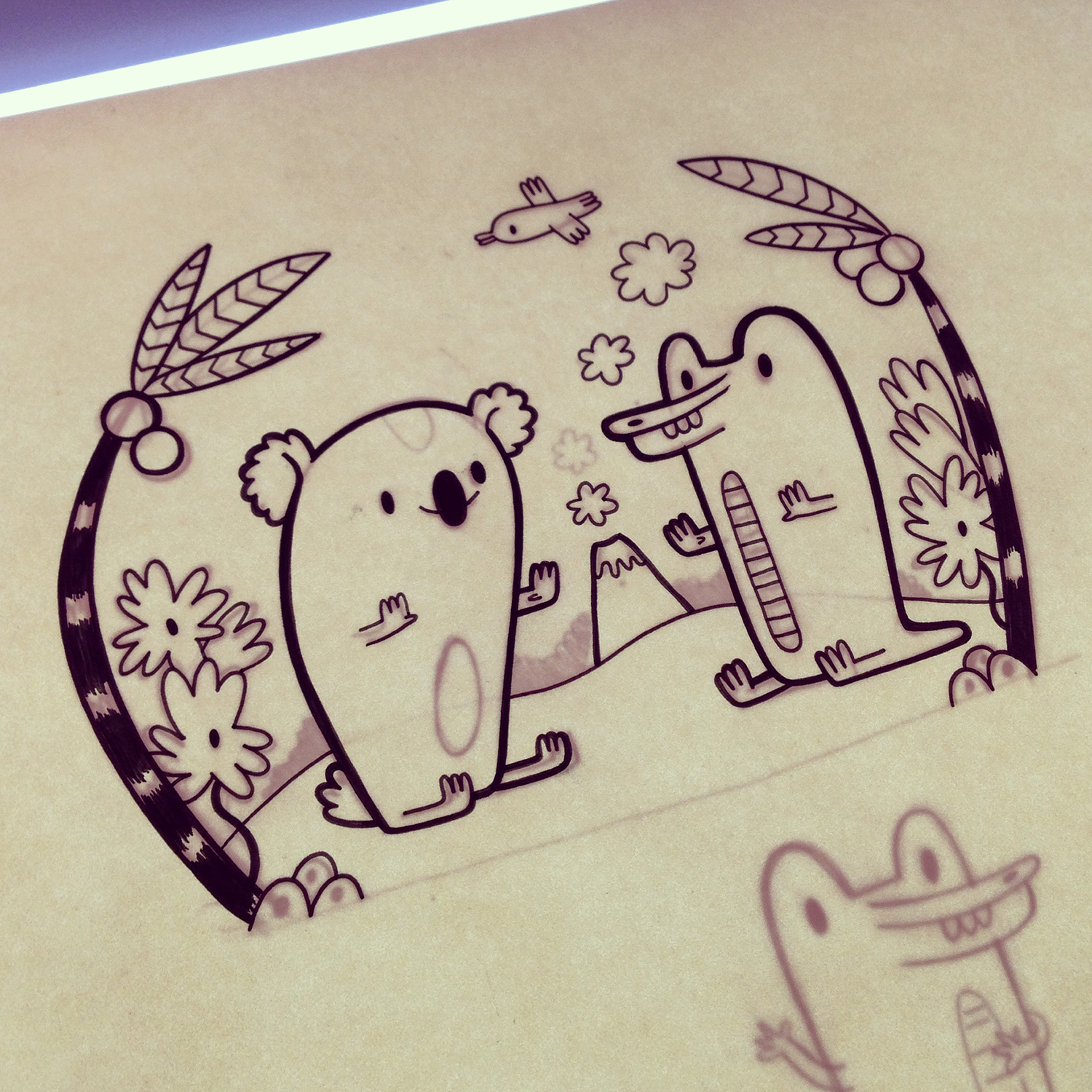
Here are the original pencil doodle and ink drawing of "Pattycake" (from my Instagram feed: @ericasirotich).  

"Pattycake" Doodle

"Pattycake" Doodle

"Pattycake" Ink Drawing on the light box.

"Pattycake" Ink Drawing on the light box.

Developing Quilliam and a Peek into my Sketchbooks

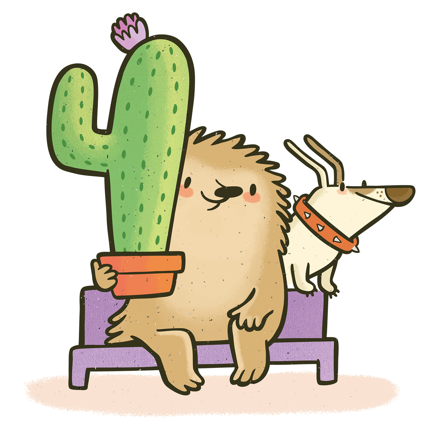
I've been pretty quiet over the last month or so because I've been working to develop Quilliam, a favorite character of mine, into a picture book concept! Here are a couple peeks at his new design. 

I've also added a new section to the site focusing on images from my sketchbooks. Here's two pages of Quilliam character exploration and visual development. I'll be adding more to this page as time goes on, so keep an eye out!  

Doggie Wonderland at Leanna Lin's

I'm really excited to participate in my third show at Leanna Lin's Wonderland in Los Angeles, Doggie Wonderland! This one is really special because it's a benefit to raise funds for Ken-Mar Rescue, an LA-based small dog rescue. My own dog, Russell, came to me by way of a similar organization that gives dogs a second chance after time at their first shelter has run out. I couldn't be more grateful for the work of groups like this. What's terrific is that 100% of show proceeds go to the rescue and all work displayed is totally affordable--less than $100 per piece! The show is co-curated by Supahcute, a blog dedicated to cuteness in general and art in particular. Naturally, I had to get in on this event.

"No Finer Friend" by Erica Sirotich

The theme of the artwork in Doggie Wonderland is "Fun Adventures with Your Best Friend" so my piece depicts one such adventure shared by a girl and her dog. I've called it "No Finer Friend." Just one framed print of this piece will be available for purchase at the show.

Show participants include Jerrod MaruyamaBubi Au Yeung and tons of other talented folks I'm honored to share a gallery wall with. Also, Joey Chou created the most adorable event poster ever. Doggie Wonderland opens with a reception at Leanna Lin’s Wonderland on Saturday, May 10, 2014 (6-10pm).

When I first conceived of this piece, I drew it as a boy and his dog. 

But I wanted more visual drama in the piece and a stronger suggestion of wind, so I decided to make the character a girl and focus on her hair blowing in the salty breeze.  

BoyGirlSketch.jpg

In the final sketch with the revised character, I added a few more critters into the mix, as I am known to do :)   

"No Finer Friend" sketch.

"No Finer Friend" sketch.

I used solid blacks in the center of the piece to amplify the girl and her best friend as the focal point.

"No Finer Friend" ink drawing. 

"No Finer Friend" ink drawing. 

I printed it at a diminutive 8" by 8" (giclee), framed it and shipped it off to Leanna Lin's this morning. Such a fun little piece for a great cause.  

And here's an adventure I recently had with my best friend :)

Erica and Russell in Carmel Valley, California.

Erica and Russell in Carmel Valley, California.

Thumbnail, Sketch, Ink, Final: Hard Hat Area

I thought it'd be neat to periodically share a piece's process from its earliest stages to its completion. I recently finished "Hard Hat Area"; my goal for this project was to visually explore a topic that's appealing to children, but that I've had little experience drawing--vehicles & construction equipment. For whatever reason I didn't expect this task to be fun, but I was wrong; I had a blast working with the more boxy shapes and mechanical details this piece required. I also realized that the best way to approach the vehicles would be to treat them as characters too, giving them as much as personality as possible.     

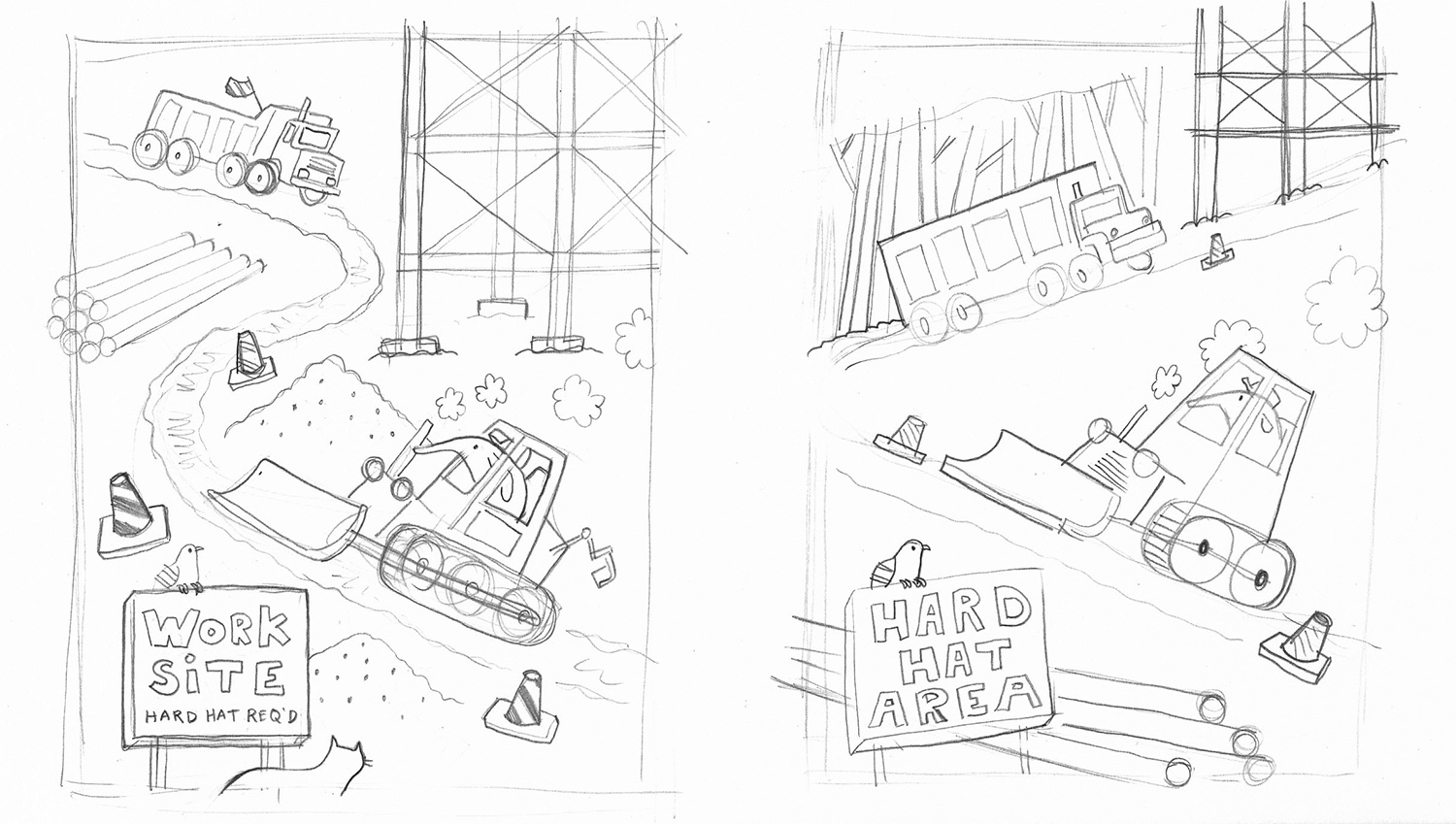
The thumbnails for "Hard Hat Area" were oriented vertically in the beginning. The first one was problematic because it would have rapidly resulted in a head on dump truck-bulldozer collision. The second is much closer to the layout of the final piece. 

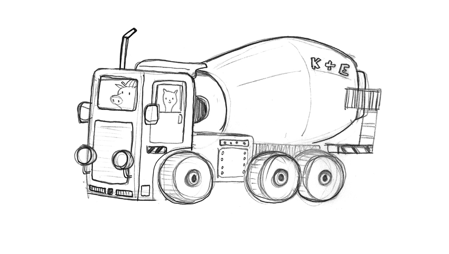
First rough sketch of the dump truck. At this stage the driver was some sort of lizard and he looked bored, probably from driving all day.

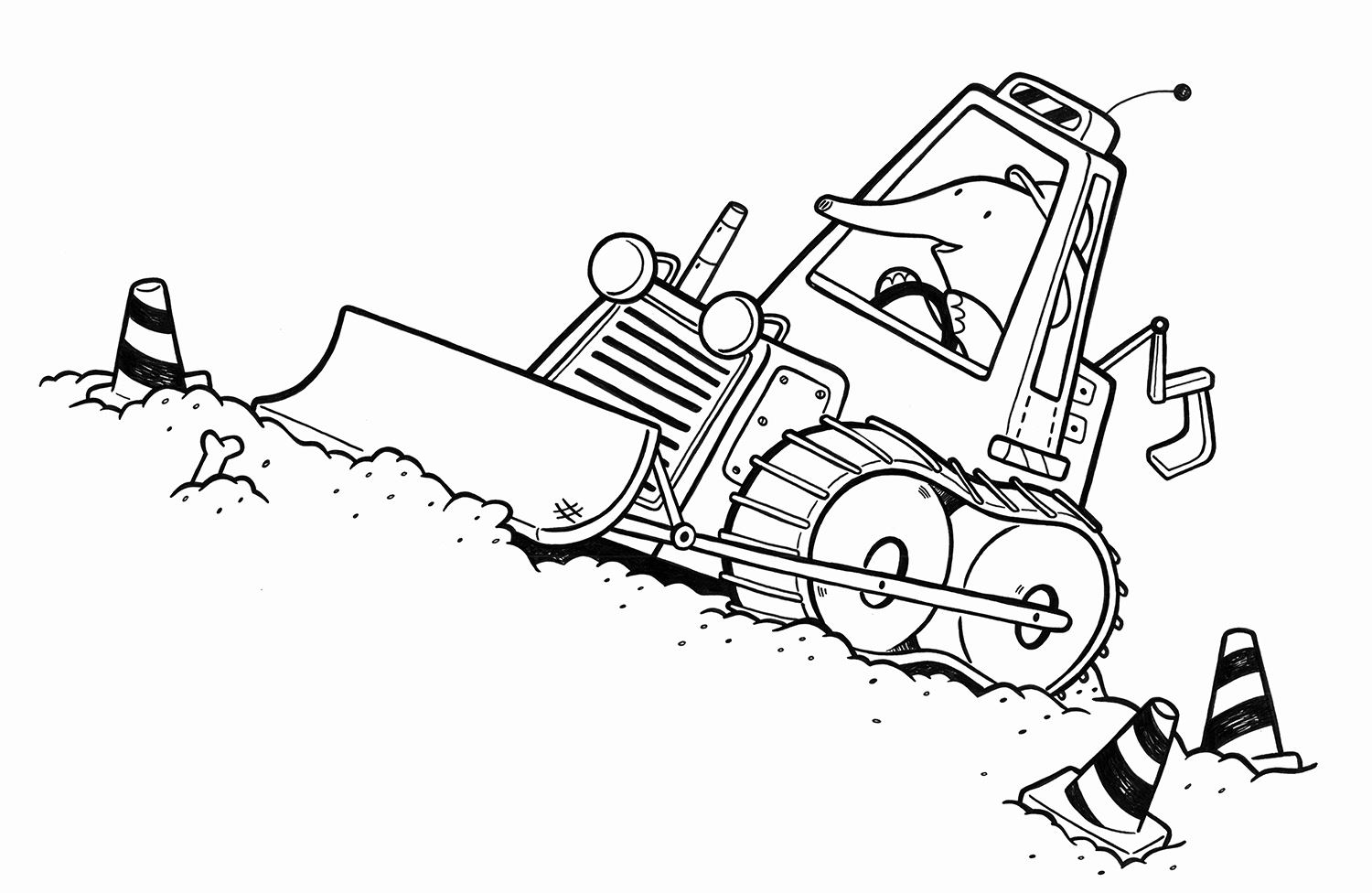
First rough sketch of the bulldozer. This version is a lot longer than what appears in both the thumbnail and the final piece. I actually really love this dozer design; for the final, I modified it for compositional reasons, making it more compact. But the next time I draw a bulldozer it'll be more like this one, for sure.    

Sketch of a vehicle that wasn't included in the final piece. 

Ink drawing of the dump truck. After refining the sketch of this vehicle I dropped it on a light pad and inked it on a fresh sheet using brush pens & Microns. I prefer this truck's driver much more than the lizard. He's a real no nonsense guy. 

Ink drawing of the bulldozer. This is a much more compact design than in the sketch. It's tighter, a bit more stylized, and fits the space better than the prior design would have. I also think it has a "younger" look than the dozer in the sketch above, which is appropriate, because I envision this to be an image for a very young audience. 

Detail of final piece. 

Detail of final piece. 

Final colored dump truck. I used some new textures and brushes on this, opting for a soft billow of stinky exhaust spewing from both vehicles, rather than the bubbly clouds that appear in the thumbnails. I overlaid a texture to give the entire piece a bit of a grittier, rougher feel. 

Detail of final piece.

Detail of final piece.

I also used a custom Photoshop brush to depict the dust and dirt flying everywhere. But that didn't stop that bear from indulging in an entire slice of Brie cheese right in the middle of the work site.  

Final piece. 

I drew, inked & colored the background elements & secondary characters separately from the vehicles; this helped me play with the piece's composition digitally (it was actually at this later stage in the process that I decided to orient the piece horizontally). I like the versatility of this process; it allows me to make modifications easily when required and really experiment with the piece's overall look and feel. 

Character Development: Abaline

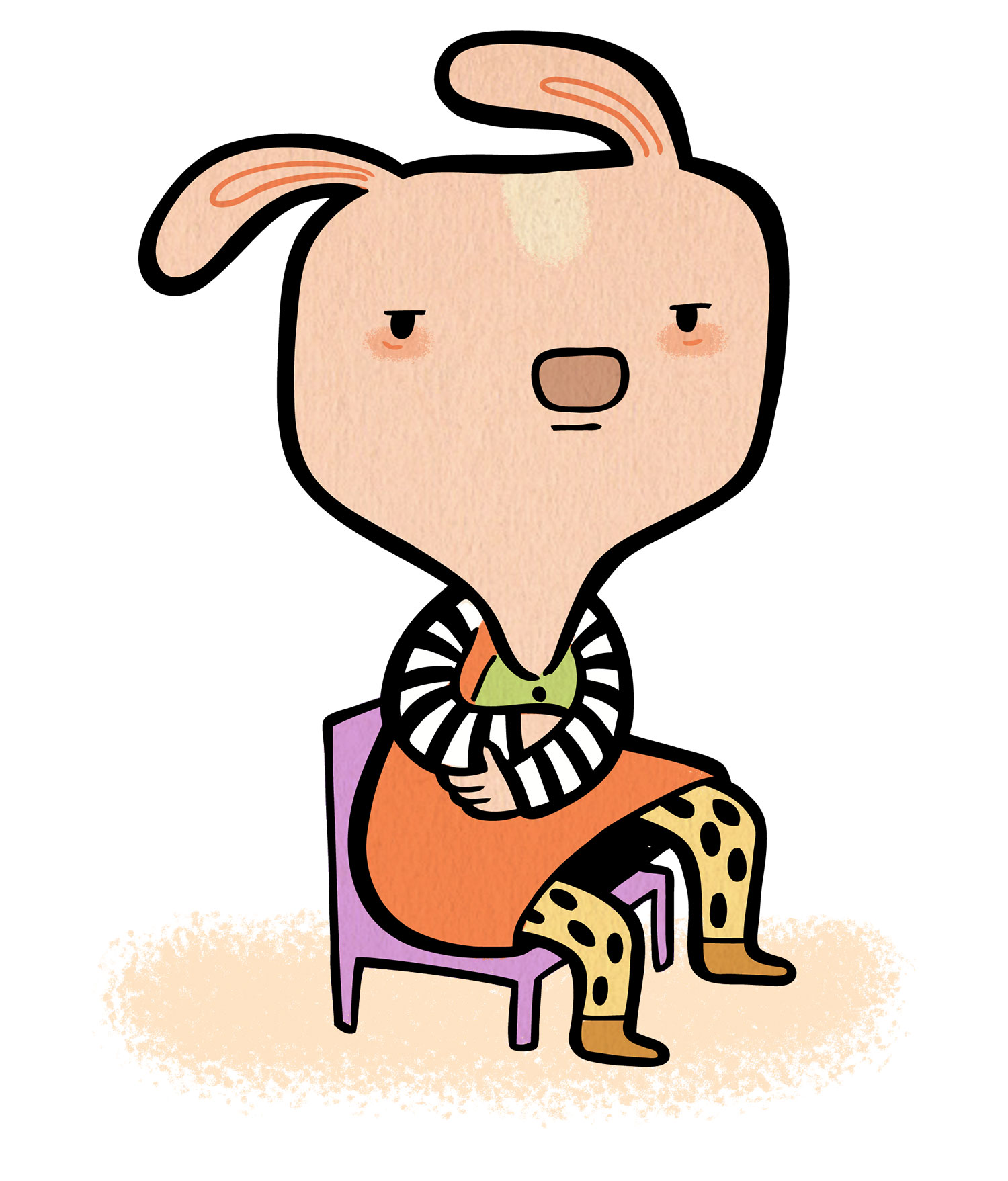
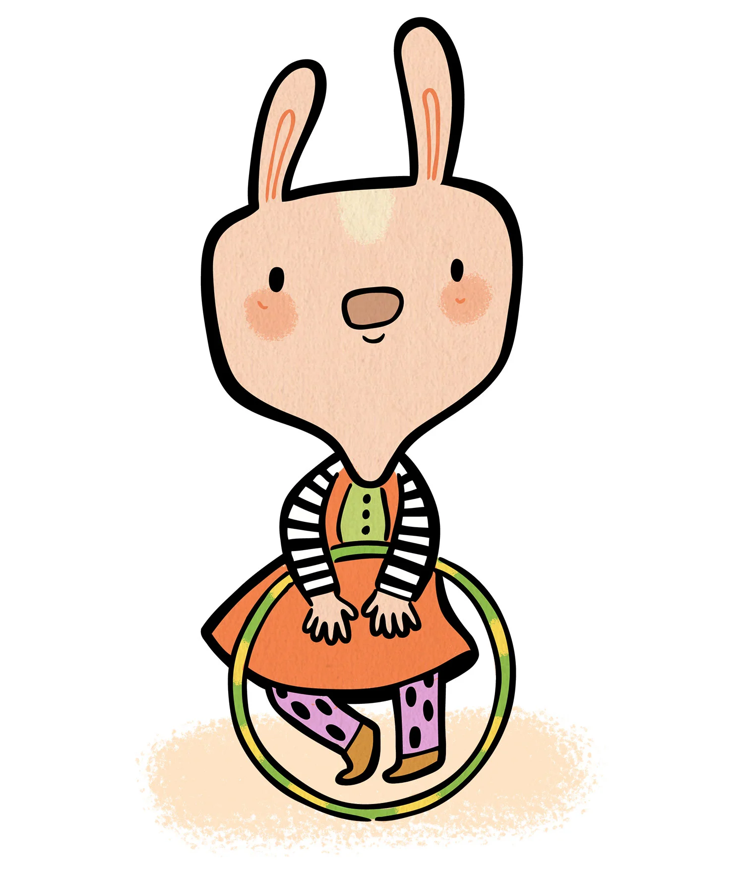
When I have a bit of time in between freelance gigs I try to focus on projects that will help grow my children's and character development portfolio. I've done quite a few character projects for clients--often these come in the form of corporate or web mascot projects--but haven't spent too much time really developing characters of my own. Last week I carved out some time to do that, and the result was this little gal. She calls herself Abaline. See more of her here.

Dinosaur Characters for Wufoo Advertising Campaigns

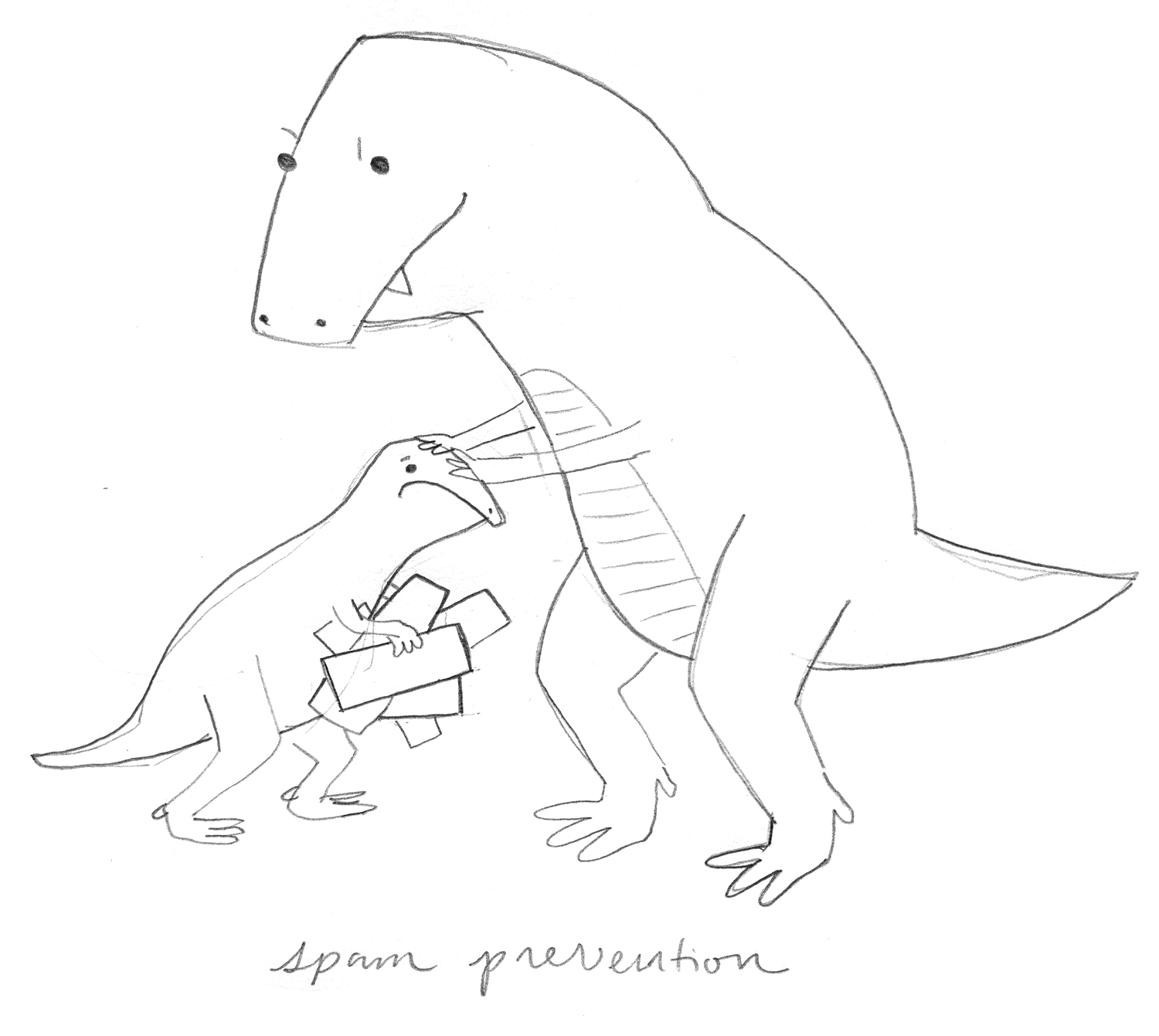
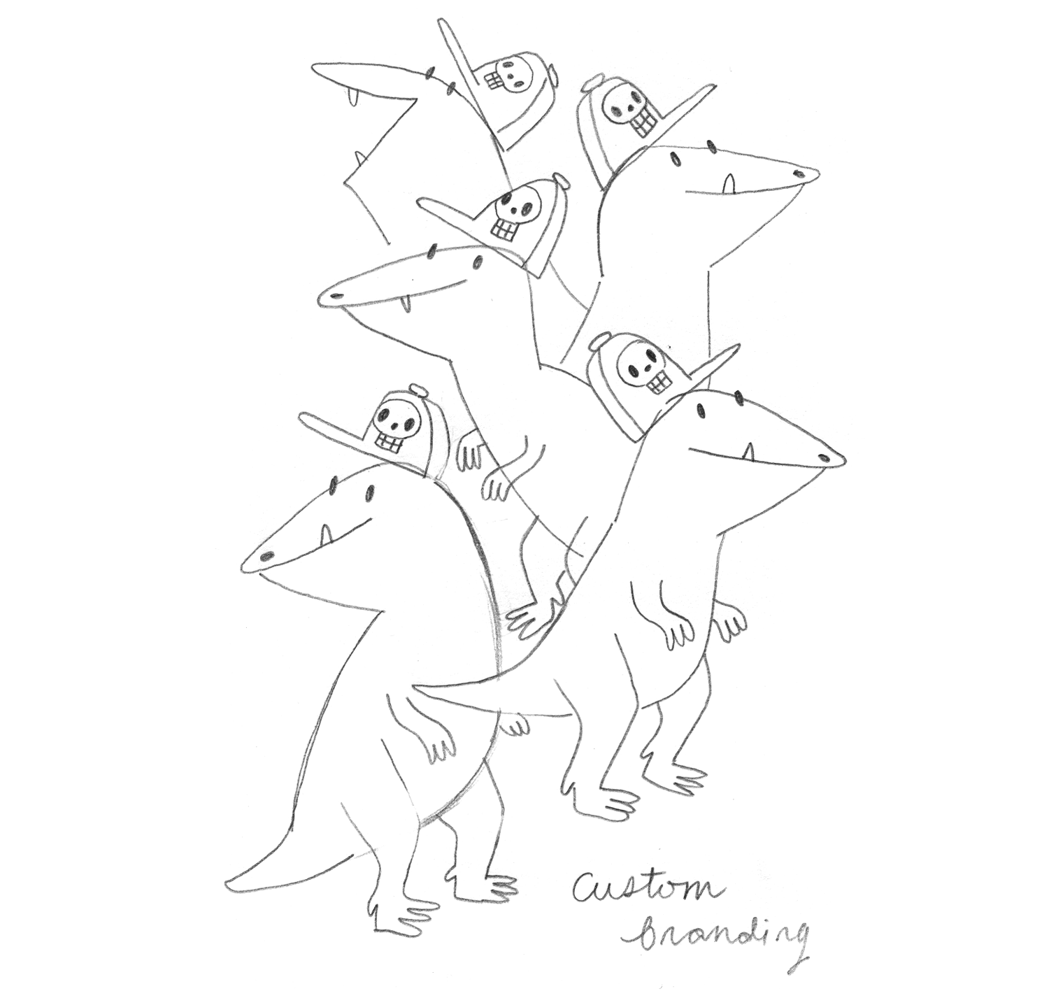
Late last year I had the opportunity to work with Wufoo on a series of images that will be used in future advertising campaigns. Each illustrates a key feature of the software using simple dinosaur characters. This project was so fun; Wufoo gave me lots of freedom to come up with quirky interpretations of each feature; my only limitations were to keep them fairly simple and to draw from the existing Wufoo brand color palette. Unlike much of my work, these guys were created wholly within Illustrator (from ink drawings of course), which was challenging at first; I always want to move back into Photoshop and add textures and other embellishing details, but I like the simplicity that resulted from this process.   

Here's a selection of the finished characters alongside their original concept sketches. You can see the rest of them here.   

Spam Prevention

Spam Prevention

Spam Prevention Sketch

Spam Prevention Sketch

Custom Branding

Custom Branding

Custom Branding Sketch

Custom Branding Sketch

Logic & Branching

Logic & Branching

Logic & Branching Sketch

Logic & Branching Sketch

Online Security

Online Security

Online Security Sketch

Online Security Sketch

Instant Notifications

Instant Notifications

Instant Notifications Sketch

Instant Notifications Sketch

Happy Year of the Pony!

The Chinese New Year is upon us and this time around we are entering the auspicious Year of the Pony!* I like it when animals symbolize things and years are no exception. Ponies are among my top three favorite creatures of all time, so I'm feeling good about these next twelve months. Here are 22 ponies to kick off the festivities.    

My "Pile o' Ponies" print for Cuddlefish Press, just in time for the New Year.

My "Pile o' Ponies" print for Cuddlefish Press, just in time for the New Year.

Last summer one of my dreams came true, which was to have a snuggle session with an Icelandic Pony. In Iceland. Here we are, having a moment. IN ICELAND. ME AND AN ICELANDIC PONY.   

Happy New Year guys!

Erica_IcelandicPony.jpg

*Yes, I am aware that it's technically the Year of the Horse. But I prefer ponies. What's the difference between horses and ponies? Both are equines, but ponies are special; they're small, smart, cute equines. More specifically, ponies "are typically much stockier than their horse relatives. They also have thicker manes, tails, and coats, so are better able to endure cold weather. They have proportionally shorter legs, wider barrels (body of the pony that encloses the ribcage and all major internal organs), heavier bones, shorter and thicker necks, and short heads with broader foreheads. They also typically have calmer temperaments and a high level of equine intelligence which can be used to a human handler’s advantage." (Thanks, Terynn Bolton, for this timely bit of equine wisdom.) 

California Printed at Rare Device

This month I had the pleasure of participating in a group show, California Printed, hosted and curated by San Francisco boutique and gallery Rare Device. The show features twelve artists' interpretations of California in print form, including work from talented Bay Area artists like Emily Proud and Christina Song. When I was invited, I immediately thought of the print I created a year or two ago, "Living California," a wildlife map of the state. I've been wanting to explore California's prehistoric fauna too, so this ended up being the perfect opportunity to do so!  

"Prehistoric California," a limited edition print created for Rare Device's California Printed group show. 

"Prehistoric California," a limited edition print created for Rare Device's California Printed group show. 

It turns out that more is known of the mammalian megafauna that lived in the state during the Cenozoic (due, in part, to specimens unearthed at the La Brea Tar Pits) than about the dinosaurs of the state's Mesozoic age. So I ended up combining creatures from all three major prehistoric periods of California's history on one map, rather than just depicting the state's dinosaurs, as originally planned. Each creature is linked to its time period with markers preceding their species' names and a corresponding key on the right side of the map.    

Here are a few of the original ink drawings included in the piece--of the Giant Ground Sloth, two species of Ankylosaur, and the Pygmy Mammoth. These are some of my favorite prehistoric creatures anyway, so finding that they inhabited the California of yesteryear was pretty exciting.

photo 3.JPG
photo 2-1.JPG
photo 1-1.JPG
Detail of the completed "Prehistoric California" print by Erica Sirotich.

Detail of the completed "Prehistoric California" print by Erica Sirotich.

"Prehistoric California," the new companion piece to "Living California," is exclusive to Rare Device for the duration of the show (until February 26, 2014). Prints, including the framed edition #1, are available from the San Francisco store and online

At the California Printed opening on January 10, 2014. Framed and unframed prints are available from Rare Device.

At the California Printed opening on January 10, 2014. Framed and unframed prints are available from Rare Device.

For a discussion of how "Living California" was created, you can visit the Ten Paces and Draw illustration blog, where I shared a process post a couple years ago. "Prehistoric California" was, mostly, created in the same way, except that some of the leg work was already done this time around!   

"Living California" by Erica Sirotich

"Living California" by Erica Sirotich

Saying things, doing things

Right around this time last year, I attended a Creative Mornings SF session that invited audience members to reflect on creative lessons learned and goals posed for the year ahead (2013). I'm not a fan of public speaking so, naturally, my fingers were crossed that I would not have to get in front of that room. Three groups of three attendees' names were randomly pulled from a hat and, surprise surprise, my name was among them. Ugh. To add to my intimidation, Lisa Congdon was sitting in the front row. Like me, Lisa is a self-taught Bay Area illustrator who realized well after college that she wanted to pursue an art career. Other than the fact that we are both obsessed with Iceland, that's probably where our similarities end. She's worked with major clients that many of us only dream of, has multiple book projects to her credit, runs a thriving Etsy shop, undertakes fine art projects and exhibits in galleries. (Here's a really cool short film about Lisa.) She's rad. Needless to say, I was nervous. 

My group was last to speak; we were invited to discuss our visions and hopes for the future (more specifically, for 2013). When the mic was handed to me, I started jabbering about how I intended to do a children's book in the new year. I didn't actually have a concrete plan or apparent opportunity to do a children's book, but it's been my primary illustration goal all along, so those were the words that tumbled out of my mouth. 

In the summer, I attended the Society of Children's Book Writers and Illustrators conference in LA. It was hugely overwhelming and inspiring. I participated in the Illustrator Intensive, Portfolio Showcase, and had a consultation with Mela Bolinao of MB Artists, the agency that represents one of my favorite children's book illustrators, Jannie Ho. (I also attended workshops put on by Jannie herself!) I came home motivated and excited but also with a sense of how massive the crowd of talent aiming to work in children's books is, how talented these people are, and how limited the opportunities seem to be.  

A few weeks after the conference, as I was contemplating how presumptuous it was for me to get in front of that Creative Mornings crowd and announce that I'd be doing a kid's book before year's end, I received an email from an illustration manager at Teacher Created Materials, an educational publisher. He found my work at SCBWI and asked me to create a series of board games for elementary-aged children. Fun! For me, children's toys, games, activities & novelty products are second only to children's books on my illustration project dream project list. And I love projects with an educational bent. So I spent a few weeks creating the first children's products to bear my name. Here's one of the board games, called Under the Sea, and a detail shot.      
Under the Sea, a board game for Teacher Created Materials.

Under the Sea, a board game for Teacher Created Materials.

Detail from the Under the Sea board game.

Detail from the Under the Sea board game.

A month or so later, Teacher Created Materials got in touch with me to see if I'd be interested in working on a second project, this one a lot more demanding and with a fast turnaround. It was, believe it or not, a kid's book! A small kid's book--like, really small--but a kid's book nonetheless! It's called ¡Di Algo! and it's a Spanish language book of poems for first grade students. I can't say that's what I had in mind when envisioning my first book project, but I certainly wasn't about to pass up the opportunity. Within seven weeks I had created, submitted, and had approved eleven spreads for the book. Just a handful of revisions were required. It was the fastest and the longest seven weeks of my career. ¡Di Algo! is due to be released in April, 2014, and I'll be able to show more work from it then. In the meantime, here is one of my favorite pages, which accompanies a poem called Doña Araña (Mrs. Spider). (On my Process page, I use it as an example to describe my illustration process, step by step.)            

Doña Araña, an illustration for ¡Di Algo!, my first children's book project.

Doña Araña, an illustration for ¡Di Algo!, my first children's book project.

I suppose my haphazard pronouncement at Creative Mornings a year ago wasn't entirely out of turn. Perhaps just putting that ambition out into the world helped initiate some momentum that led me to attend SCBWI, which led to the string of opportunities that resulted in my first little book project.  

I feel like I'm entering 2014 with a bit more confidence than the previous year. I've got a personal book project in the works now, perhaps to be self-published; perhaps I'll build up the gall to pitch it to publishers. As much as I enjoyed working on ¡Di Algo!, I am excited to have more creative control over my next major project, to have the opportunity to inject more quirk and character into it and to have more time to let it marinate and develop before fully realizing each and every page.

Having worked as a full-time freelance illustrator for nearly four years now, I've become more and more aware of how each project paves the way for and builds upon the next. A career in illustration is a process of gradual unfolding and growth. 2013 was my first year really working in the market I've had my eye on all along, and I feel I've only scratched the surface. In 2014, I hope to work on more children's publications and novelty products. I can't wait.